Putting It All Together
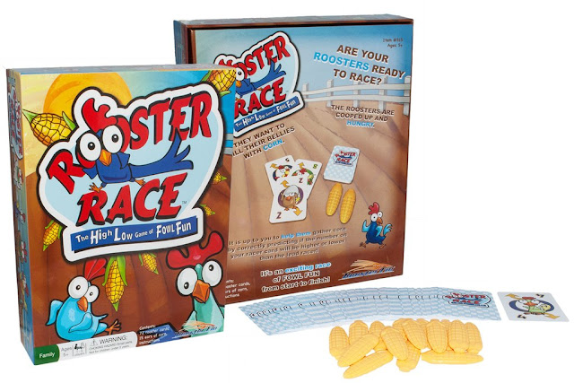
In the last two installments, we talked about creating the characters, the logo, and the game assets. This brings us to the all important…. packaging. After all, you need something to put it all into.The initial rough we wanted to have a fun barnyard feel to reinforce the rooster concept.We roughed in our idea with the logo, fun characters and other necessary elements like copy, logos, UPC, item numbers, contents, etc.
This early concept which at the time was being shown to big retailers and had to change constantly to satisfy the particulars of each one of them. Here’s a few examples of criticisms: too much illustration, character getting in the way of the logo, too much background, logo needs to be bigger, vertical to horizontal to vertical again.
 |
| Rooster Race Package Front Horizontal |
 |
| Rooster Race Package Back Horizontal |
 |
| Rooster Race Package Back Vertical |
 |
| Rooster Race Package Back Vertical |
The final decision was made to go vertical, but the logo needed to be much bigger to stand out on the shelves. So, in the end after all the back and forth, we ended up with this:
Oh… let’s not forget instructions. An area of game development that is often left to the end. A mistake. The graphic layout and the actual verbiage of instructions are so important they really need to be developed alongside the game and the game mechanics. i.e. it’s easy to understand where a discard goes when you see an image, but if I just say discard, you may end up with the game in the trash. We added little bit of fun to otherwise basic instructions by adding some characters in the background in a light gray.
We design our games based on the giggle meter. If while designing sketches or laying out packaging and game assets, giggles erupt in the studio, we know we're on the right track. We hope you've got a giggle out of this making of series. Stay tuned for more behind the scenes posts.
Find out more and see a fun video of how to play the game with Joe Roosterfin over at Roosterfin Games.


No comments:
Post a Comment