Friday, October 20, 2017

Adding Flavor and Fun to a Game

Going Beyond the Basic Game Mechanic

with Wizard Roll by RoosterFin Games designed and illustrated by Kurt Keller and Traci Van Wagoner at Imagine That! Design

Wizard Roll Going Beyond the Basic Game Mechanic by Imagine That! Design

There a number of things to think about when designing and developing a game


While all of these are important, we want to talk about going beyond the basic list to find that extra component that adds either fun, interest, or knowledge beyond simply playing the game.

The simplest form of this is flavor text -- details in the game that don't effect the game play but add flavor and help immerse the player more fully.


When we design and develop a game, we like to find elements we can weave into the game play that  helps immerse players into the game more fully, adding another layer and dimension to a game, like the frosting on a cupcake. It can be something that reveals back story, character, and/or a story line -- something that helps you delve deeper into role playing and getting lost in the fun of playing a game.

This element doesn't effect the pure outcome of the win but highly effects your enjoyment and willingness to come back to the game and play again and again. It's that something that later in the week -- during school, work, doing homework or chores -- a memory of playing the game pops up that makes you smile or, better yet, giggle. And even better, the ultimate goal -- days later you repeat a phrase or something from the family game night.

Mille Bornes "coup fourré !" became a terminology of "I gotcha!" and who didn't love shouting that out while playing?


These are the important things in life. Games can make a difference by bringing joy and lasting memories.

Wizard Roll Going Beyond the Basic Game Mechanic by Imagine That! Design
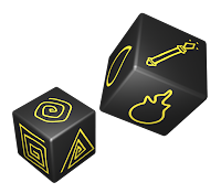
For Wizard Roll, we took the game concept presented to us and wrapped the pattern building and pattern recognition mechanics into a story line, adding the element of players being wizards and building spells with rune tiles and elements.

We also made the spell each player is trying to build a secret? Which is fun, but is a game mechanic which effects the game play. So, what else could we do?


Roll the dice, build your spell or use the wand for a Take That! play. This adds another layer to the game, but it is another game mechanic and effects the game play directly.

Wizard Roll Going Beyond the Basic Game Mechanic by Imagine That! Design

 Our coup fourré

The final level of role playing we added was to give the runes fun and magical sounding words. When a player collects all the rune tiles and elements needed, they use the reference card and sound out the parts of the spell!

Perfectly magical.

Go ahead, try out some combinations from the Reference Card above.


And like magic, you've created a memory.

We even designed the box to look like a magical spell book. We hope you will buy Wizard Roll and have fun being a Wizard for an evening and many more evenings after.
Wizard Roll Going Beyond the Basic Game Mechanic by Imagine That! Design

To find out more:

You can find a great review of Wizard Roll on SAHM Reviews. You can also find many more games we designed and illustrated for RoosterFin that are great for family game night on their website. And you can get a behind-the-scenes look at the making of another fun game from RoosterFin that we designed and illustrated, Rooster Race in our 3 part series, The Making of a Fun Family Game.

And now for a gaming quiz...

Well, not a quiz exactly, we'd just love your input:
How do you get people to read the flavor text when playing or creating a game? Can you think of any other immersion techniques in game design? What other games have this extra element, or phrases you take into real life? We'd love to hear about it. Please share in the comments.

Game on!

Don't forget to Follow Us to get all the updates on our latest projects, fun games to play, great books for your kids and more.

Friday, September 22, 2017

How We Got Started in Graphic Novels


Nelson Beats the Odds series designed and illustrationed by Traci Van Wagoner and Kurt Keller


Creative Medicine LogoNelson Beats the Odds was the first in a series of graphic novels we've designed and illustrated for Ronnie Sidney II at Creative Medicine.

In the spring of 2015, Ronnie came to us with a story that had really clear descriptive scenes for practically every sentence which made it difficult for us to do a standard picture book spread. It was shouting out for a graphic novel approach. Not something we'd done before or quoted for. Boy, are they a lot of work. We suggested this to the client, and he loved the idea. Since he was going to be presenting and showing to a grade school and older audience, he thought the graphic novel would go over well with them. So what began as 32 pages with 16 spread illustrations turned into 32 pages with approximately 170 - 180 illustrations.

Style Research

Since this was a new style and genre for us, it required research. Research and more research. We researched, and read, and googled, and studied, and sketched, and researched some more looking at graphic novels, comic books, styles, themes, directions, applications, etc. You can see some of the reference that provided inspiration on Traci's Pinterest page.

Character Design

Character design working with photos provided by the client. Nelson and his friends which are based on Ronnie, his friends, and his teachers.
Character Design sketches for NBTO by Imagine That! Design


Text Dummy and Symbolism

After getting some characters establishing, a text dummy is created where we break the text up into spreads and loosely sketch out the scenes.

Work begins with a text dummy for Nelson Beats the Odds, Imagine That DesignCharacter and scenes sketches for Nelson Beats the Odds, Imagine That Design


Creating the Cells, Scenes, and Factoids

After doing a series of sketches and designs, we created the cells in InDesign, knowing that the cells themselves were going to add to the creative design and message of the book. We outputted those as pngs and placed them as masks in Photoshop for our first round of sketches.

Nelson Beats the Odds cell design and layout by Kurt Keller at Imagine That! DesignSince this story is about the struggle of overcoming learning disabilities, the client wanted to have the theme of mountains in the imagery demonstrating the struggle of overcoming the odds. So we set about trying to integrate this element into the design. We created shapes and cells to help bring in this feel as a vehicle of communication.


Nelson Beats the Odds interior cell desgin and layout by Kurt Keller at Imagine That Design
Ronnie also wanted to capture the feeling of sneaking into the special education classroom so his friends wouldn't see him. So, we created a ninja feel with Nelson sneaking to class not being seen.

This is where Nelson finds a teacher who understands and helps him to grow and gain confidence.


We had the additional challenge of getting so much copy into the book. Not only did we have a story line, but since Ronnie would be using this book as an instructional tool, he wanted to include other information, question/answers, facts to back up Nelson's story. We decided to create new call out sections in yellow for Notes / Facts / Quotes.
Nelson Beats the Odds interior design by Kurt Keller at Imagine That Design

Getting the work done

Since we were also the book designers this gave us the ability to control both ends of the whole book making progress, working the illustrations and design together which gave it much more of a cohesive feel and made the project flow smoothly.

With the basics established, it was time to get into the nitty-gritty of completing the book. Here's a working screen shot from Photoshop showing several spreads in various stages of progress.
Nelson Beats the Odds work in progress by Imagine That! Design


Ronnie was very happy with the end result, so much so that he wrote another book and another so we now have a series of graphic novels. Tameka's New Dress with a colorful patterned dress as the vehicle for Tameka's confidence to stand up to bullies, and Rest in Peace RaShawn where we worked only in black and white with highlight colors to pack an emotional punch. This was an emotionally intense book to illustrate -- and that's another story. And speaking of another story, we have a new book for this series in the works. We'll share more about that later. 

For more behind the scenes information about the Nelson Beats the Odds, check out this post on Traci Van Wagoner's illustration blog, Celebrate the Little Things, Hard Lessons Learned.


Nelson Beats the Odds cover art by Traci Van Wagoner, designed by Kurt Keller, Imagine That! Design

About Nelson Beats the Odds:

Nelson use to think school was all about playing around and talking with his friends. When he learns that he’s been placed in special education, he fears being teased so he keeps his learning disability and ADHD diagnosis a secret. With the encouragement of his parents and assistance from Mrs. T., his special education teacher, Nelson pushes the boundaries and discovers his potential. His hard work pays off when he graduates from college with his social work degree.

Nelson Beats the Odds is an inspiring story that celebrates friendship, resilience and empowerment. The striking illustrations give life to Nelson Beats The Odds while the author’s story is perfect for students diagnosed with learning disabilities or mental health disorders. Imagine That! Design provided the illustration, layout & design and formatting services. The company is located in New York City.

This book and the others in the series are available at Creative Medicine :
http://www.creative-medicine.com/nelson-beats-the-odds.html
Or on Amazon
Check out Ronnie's Amazon page for links to all the books


 All images @Imagine That! Design

Friday, September 15, 2017

The Making of a Fun Family Game, Part 3

We're sorry for the delay in bringing you the last installment of the Rooster Race journey. We hit a big road block in another project that put a kink into all the works. Anyway we're back and ready to share some more creation fun.
Rooster Race a High Low Game of Fowl Fun from Roosterfin Games designed and illustrated by Imagine That! Design


Putting It All Together

In the last two installments, we talked about creating the characters, the logo, and the game assets. This brings us to the all important…. packaging. After all, you need something to put it all into.

The initial rough we wanted to have a fun barnyard feel to reinforce the rooster concept.We roughed in our idea with the logo, fun characters and other necessary elements like copy, logos, UPC, item numbers, contents, etc.


Rooster Race packaging rough by Imagine That! Design

This early concept which at the time was being shown to big retailers and had to change constantly to satisfy the particulars of each one of them. Here’s a few examples of criticisms: too much illustration, character getting in the way of the logo, too much background, logo needs to be bigger, vertical to horizontal to vertical again.


Rooster Race horizontal version of the package front by Imagine That! Design
Rooster Race Package Front Horizontal
Rooster Race horizontal version of the package back by Imagine That! Design
Rooster Race Package Back Horizontal

Rooster Race vertical version of the package back by Imagine That! Design
Rooster Race Package Back Vertical
Rooster Race vertical version of the package front by Imagine That! Design
Rooster Race Package Back Vertical
 

The final decision was made to go vertical, but the logo needed to be much bigger to stand out on the shelves. So, in the end after all the back and forth, we ended up with this:

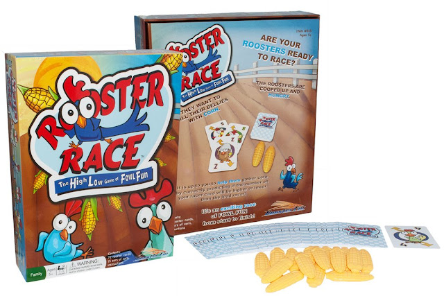
Final package back of Rooster Race game by Roosterfin Games designed and illustrated by Imagine That! DesignFinal package front of Rooster Race game by Roosterfin Games designed and illustrated by Imagine That! Design
 
Oh… let’s not forget instructions. An area of game development that is often left to the end. A mistake. The graphic layout and the actual verbiage of instructions are so important they really need to be developed alongside the game and the game mechanics. i.e. it’s easy to understand where a discard goes when you see an image, but if I just say discard, you may end up with the game in the trash. We added  little bit of fun to otherwise basic instructions by adding some characters in the background in a light gray.


Instruction front page for Roosteer Race by Roosterfin Games designed by Kurt Keller at Imagine That! DesignInstructions for Roosteer Race by Roosterfin Games designed by Kurt Keller at Imagine That! Design


We design our games based on the giggle meter. If while designing sketches or laying out packaging and game assets, giggles erupt in the studio, we know we're on the right track. We hope you've got a giggle out of this making of series. Stay tuned for more behind the scenes posts.


Find out more and see a fun video of how to play the game with Joe Roosterfin over at Roosterfin Games.


Rooster Race Game layed out in a fan shape designed and illustrated by Imagine That! Design


Friday, September 1, 2017

The Making of a Fun Family Game, Part 2

The Rooster Race Journey

continues with giggle worthy character development of the racing roosters

Last week we started the rooster race journey and ended with a sneak peek at the fun rooster characters that make up the game. 

We spent a good deal of time refining the overall character looks as well as individual personalities of the characters since so much of the game play depends on the characters.
We had a ton of fun creating this waky racing characters, and we hope you enjoy our character development journey. 
 
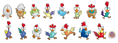
Here's the character line up.
 
Rooster characters created by Imagine That! Design

 Ready! Set! Go!

Sketch until there’s a giggle:

We start with rough pencil sketches and designs exploring the looks and personalities of the characters. With these guys we wanted to make sure they're cute, but also wacky and, of course, racing and capturing some of the frantic feel of a racer. Once we get a giggle going, we know we’re onto something. The last page is the page of the best of all the pages of sketches to show the client.
 
Imagein That! Design rooster sketches developing characters for Rooster Race Game
© Imagine That! Design
Imagine That! Design rooster characger development sketches for the game Rooster Race
© Imagine That! Design

characgter development rooster sketches by Imagine That! Design for Roosterfin Games
© Imagine That! Design

The fun folks at Roosterfin Games giggled. Good, we were on the right track. Next we took any suggestions and thoughts from the client and ran with the roosters they picked and took them to the next stage.

Refined rooster sketches by Imagine That! Design for the fun family game Rooster Race
© Imagine That! Design
 
Rooster Character color options created by Imagine That! Design for Rooster Race by Roosterfin Games 
With the general look of the characters defined, we finalized a couple finished illustrated looks of one of the characters to send to the client to establish the end result which will be applied to all the characters. Option C was the final choice.
During all this we’re also defining and refining the graphic design of the cards. No point in designing a character that doesn’t fit. We offered the client a couple options for the look of the cards.
 
Card options for Rooster Race by ITD
 
At the finish line, this is what we ended up with for the Rooster Racing cards. Giggle worthy, right?
 
Rooster Race card back designed by Imagine That! Design for Roosterfin Games

RoosterfinGames Rooster Race cards designed and illustrated by Imagine That! Design
 
 
Game Assets
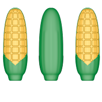
This game concept also needed some 3D parts. This was a bit of a new adventure for us. The client asked for corn, we gave them corn. We created this in Cinema 4D a 3D program. They created the corn on 3D printer.
3D Corn created by Kurt Keller at Imagine That! Design with Cinema 4D3D Corn created by Kurt Keller at Imagine That! Design with Cinema 4D


3D corn printed on 3D printed by Roosterfin Games from ITD 3D drawings
3D printed corn by Roosterfin Games
 
  
We have come to the end of the journey for this week. We hope our cute rooster characters brought a giggle or two.

Do you know of a giggle game? Any game where you look at the packaging, read the cards, read the instructions and have an uncontrollable giggles. We’d love to hear about it in the comments below. Thanks for stopping by!

Be sure to come back next week for the conclusion of the rooster's journey with all the important packaging and instructions, where you'll see us putting it all together. Until next time, you can buy your own copy of this fun family game here
 
The fun family game Rooster Race
 
 
All images ©Imagine That! Design, all rights reserved

Friday, August 25, 2017

The Making of a Fun Family Game, Part 1

The Rooster Race Journey

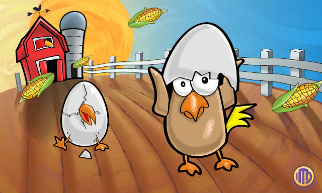
The sun rises over the farm. Here comes the roosters. And boy are they hungry!
Cute farm and chick illustration by Imagine That! Design
©2015 Imagine That! Design


Rooster Race, The High Low Game of Fowl Fun was one of the first games we helped bring to life with Roosterfin Games. 


 2017 Seal of Excellence Award by Creative Child Magazine.
A fun family game, Rooster Race, designed and illustrated by Traci Van Wagoner and Kurt Keller

The Beginning:

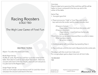
This is how it all. We got an initial verbal brief from the Joe Roosterfin with a description of the game and basic imagery. Then he sent us a rough instruction sheet outlining the game play and cards with basic clip art. 


Client Brief Instructions for new game, Rooster Race, for ITD to develop
Initial Instructions
Imagine That! Design gets an initial brief for developing a new family game, Rooster Race
Initial Cards


Logo Development:
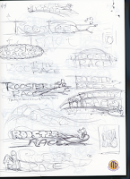
One of the first things we do with a new concept is create a logo. We start by researching other similar products, colors for the overall game, fonts, image and illustration styles, and overall looks to help us figure out where we're going and which direction we should take, i.e. character vs. straight type logo design. Then we explore the concept and various directions with rough sketches. Starting with very loose sketches to more detailed choices which we send to the client. We design with the giggle factor in mind. Once one of us starts giggling while working on a project, we know we're on to something.

Logo Sketch Options for the family game Rooster Race by Roosterfin Games
Rough Sketch Options
Logo warm up and exploration sketches by Imagine That! Design
Rough Sketches

Final Rooster Race logo sketches  created by Imagine That! Design for client approval
Final Logo Sketch Options
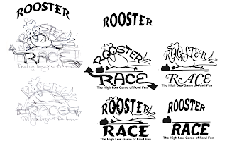
Upon approval of a direction from the client (and hopefully we've made them giggle too), we dive in to refining the design, breaking it down into parts, colors, characters, fonts, tag line, etc. and start debating its pieces and parts until we are happy with the overall look and story it tells.
 
Rooster Race Logo Development by Imagine That! Design
Rooster Race Logo Development
The logo for this game begged to be a heavy character concept reflecting the cute characters on the cards. The client loved it!
Rooster Race Final Logo
Rooser Race logo on black background by Imagine That! DesignRooster Race black and white logo for instructions by Imagine That! Design
Character Development:
We spent a good deal of time refining the overall character looks as well as individual personalities of the characters. Here's a sneak peek of the character line up.
Rooster Race characters designed and illustrated by Imagine That! Design
Come back next week to continue the rooster's journey, starting with giggle worthy character development. Until next time, you can buy your own copy of this fun family game here.
Cock-a-doodle-doo!
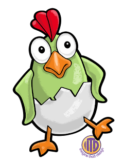
Cute baby rooster character from Rooster Race, a game developed by Imagine That! Design for Rosterfin Games